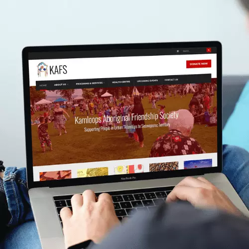
The KAFS website struggled with accessibility, content layout, and design, as well as updates being a challenge due to the back-end. We decided to use red as the primary colour, as it often symbolizes courage, strength and beauty. We improved contrast ratios and modified the layout to help with readability and user flow. The site build also coincided with a fundraiser for a new office building, so we took this opportunity to integrate their GoFundMe campaign into the website to help raise funds. We also upgraded their back-end system to help them manage and edit their own content.
The new site has improved accessibility, is mobile friendly and has streamlined navigation. All users can now view the services, programs, and fundraising with minimal clicks while back-end users are able to update the site with ease.